


Empowering, educating, celebrating, and delighting the modern IT professional.

Featured article
The 2026 State of SaaS report
Discover the latest 2026 SaaS statistics on AI adoption, shadow AI, SaaS sprawl, automation, and the future of enterprise governance.

How to choose the right app: The IT handbook for 2026
Learn how to choose the right app. Discover essential procurement tips, best practices for how to buy a SaaS app, and top strategies for replacing a SaaS tool while mastering spend management.

Self-service access provisioning: How to give employees what they need without losing control
Self-service access provisioning done right: structured request workflows, automated approvals, audit trails, and zero manual provisioning for IT.

AI governance isn’t an IT problem, it’s a business risk problem
AI governance is no longer an IT function alone. Learn why operational AI governance is becoming a board-level priority for risk, compliance, and growth.
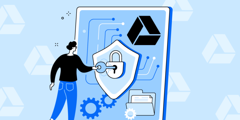
Improve Google Drive security for the AI era
Learn how to improve Google Drive security in the AI era. Discover expert solutions for automated data loss prevention, file governance, and controlling SaaS data sharing.

How to safely adopt AI in IT (without breaking governance)
Learn how to adopt AI in IT without introducing unnecessary risk. Explore common risks of AI in IT operations, governance best practices, and the safeguards IT teams need to deploy AI with confidence.
Product tip Tuesday: OAuth discovery and beyond
App and file discovery is important, but how IT teams remediate what they find is a critical next step. Here’s how to automate those tasks in BetterCloud.

3 IT management tasks AI can do in seconds
Explore IT management tasks AI can do faster, including user access audits, employee offboarding, and bulk admin changes.

Data protection and SaaSOps in your Zero Trust journey: Strategies for 2026
Discover how SaaSOps drives true Zero Trust data protection. Learn how to secure and govern your SaaS stack using automated alerts and orchestration.

The AI-driven SaaS industry shift in mid-2026: From point solutions to platforms
The SaaS industry is evolving fast. Learn traditional, AI-enabled, and AI-native SaaS trends, emerging pricing models, and why platforms dominate in 2026.

Introducing the next generation of BetterCloud
BetterCloud’s next generation platform helps IT teams govern SaaS, AI agents, and workflows with AI-native IT operations.

The SaaS onboarding process: A complete guide for IT & HR teams
Learn how to build a scalable SaaS onboarding process, streamline employee onboarding SaaS workflows, and automate user provisioning for new hires.

The ongoing challenge and opportunity of SaaS license spend management
A practical framework for enterprise SaaS cost optimization from unused license reclamation to shadow IT visibility and control.