How WFH has reshaped our work behaviors: A data deep dive
July 6, 2020
7 minute read

We are now 100+ days since COVID-19 caused nationwide lockdowns. Since being thrust into remote work, the main question on people’s minds has been: “How will this change work moving forward?”
At BetterCloud—like most companies—we migrated to fully remote work in March 2020, but unlike a lot of companies, we have guaranteed work from home until at least February 1, 2021. This has been a major shift for us. While our company did not prohibit working remotely, we were founded on a strong in-office culture that our CEO David Politis consistently touted.
Given this drastic change, the analytics team at BetterCloud was curious how COVID-19 ripple effects have altered BetterCloud, through the lens of the data we ingest. We have anecdotally heard that our customers have been dealing with the same changes, so we feel confident this analysis is indicative of a broader trend in the workplace. We have broken up the effects into a few sections:
- How have BetterClouders’ workstyles changed?
- How have our customers’ behaviors in the product changed?
- How have our interactions with prospects and customers changed?
How has your workplace changed since COVID-19? We’ll be discussing this topic in the BetterIT Slack community, home to 4,000+ IT professionals. Sign up and join the convo!
Below are some of the major conclusions from our analysis:
-
- Large meetings are a thing of the past. When working remotely, small targeted meetings are key to productivity. [Jump to section]
- Remote tools like Slack, Zoom, and Google Meet are being used to their full potential. [Jump to section]
- Without lengthy commutes, people are starting and ending their work days earlier; IT/support teams should plan their hours accordingly. [Jump to section]
- Without the ability to stop by a co-worker’s desk to ask a quick question, employees want self-serve analytics. [Jump to section]
- Given the shift to remote work, people are craving a sense of community to connect with others. This is manifesting through an increase in public channel creation in Slack and the influx in growth of BetterIT. [Jump to section]
How have BetterClouders’ workstyles changed?
Meeting size and frequency are decreasing


We analyzed Google Calendar data from the G Suite Admin console and discovered the following: Overall meetings are decreasing, and the number of attendees per meeting is also decreasing.
The blue bars in the chart are the number of meetings for Monday to Friday each week, and we have gone from front-loading meetings on Mondays and Tuesdays to a more even distribution of meetings, albeit at depressed levels.
The orange line is the recipient count for the calendar invites, and we witness a strong downward trend.
Intuitively this makes sense; the productivity of a virtual meeting scales inversely with the number of active attendees. As we have moved to fully remote work, it is more difficult to have roundtable meetings via Zoom or Google Meet.
Increase in Slack usage, especially in the number of files uploaded
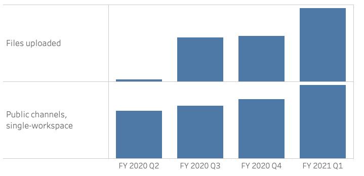
Unsurprisingly, we have seen a dramatic increase in Slack usage since we started working remotely. Specifically, Slack is being used as a more complete collaboration tool versus just quick messaging.
From FY 2020 Q4 to FY 2021 Q1, we saw a 61% increase in the number of files uploaded in Slack.
We imagine that this is similar for companies across the country. With the increase in files uploaded, there is an increase in the risk of employees sharing sensitive information over Slack. BetterCloud’s Targeted Content Scanning feature, which allows you to scan files for sensitive information across apps like Google, Slack, O365, Box, and Dropbox, can help mitigate this type of risk.
Additionally, public channel creation increased as employees sought more ways to connect with each other virtually. In fact, our IT team encouraged this to keep BetterClouders engaged and connected.
Google Meet and Zoom usage have skyrocketed

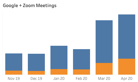
Work from home inevitably led to a rise in Google Meet and Zoom usage. We collectively spent 533K minutes on Zoom in April 2020 and saw a 220% increase in the number of Zoom participants from February 2020 to March 2020.
At the beginning of work from home, BetterCloud upgraded its Zoom SKU, but the data shows people still defaulted to using Google Meet the majority of the time (we are a pretty dedicated G Suite shop). Anecdotally we’ve heard from our employees that folks like Google Meet for 1:1s and Zoom for group and external meetings.
Strong increase in Tableau usage as people become more self-sufficient
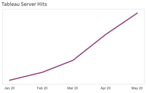
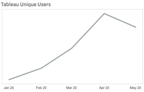
One of the major goals of the Data & Analytics team, when it was founded in 2016, was to “democratize data at BetterCloud.” We started a long journey of extracting data from all the applications we use into a centralized database, and then layering Tableau dashboards on top to allow employees in different verticals to fish for themselves.
Tableau usage data indicates a strong upward trend in usage, but remote work has accelerated the trend. Our thought is that people are now unable to tap their neighbor on their shoulder to ask questions, and instead would have to message them and wait for a response. People will try to be self-sufficient and solve problems on their own. To that end, we saw a 67% increase in the number of monthly users from January to April 2020.
How have our customers’ behaviors in the product changed?
More complex automated workflows in BetterCloud—with more actions
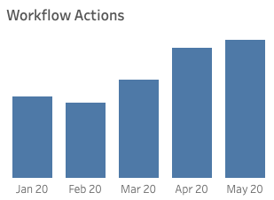
BetterCloud gives you unparalleled ability to build deep, complex, automated workflows to manage your users and data. Given the uniform transition to remote work for our customers, we analyzed how our product usage was impacted.
As we expected, workflow usage increased in the months following COVID-19.
Interestingly, we saw an outsized increase in the number of actions customers were executing compared to the number of overall workflows being executed. This indicates customers were running more complex workflows with more actions.
From BetterCloud’s perspective, this is an amazing outcome. More actions being run leads to more time being saved by IT admins and more value derived from BetterCloud!
A 53% increase in offboarding usage
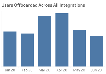
One of the most popular use cases of BetterCloud workflows is user lifecycle management. One of the data points we were most interested in was offboarding usage once the economic impacts of COVID-19 became an unfortunate reality.
What we saw aligned with the broader economy; offboarding usage increased 53% in March 2020 compared to February 2020.
This outpaced normal cyclical offboarding and aligns anecdotally with many of the layoffs our customers experienced.
To that end, we found our customers leveraging our vast library of actions to offboard users in Google, Zoom, Okta, OneLogin, Slack, Box, Zendesk and many other apps.
How have our interactions with prospects & customers changed?
A new 8-4 workday
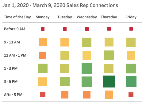
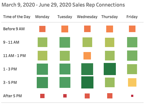
The BetterCloud sales team routinely analyzes sales connection patterns to understand trends and areas for improvement. We took a look to see if there were any changes in connection patterns pre- and post-COVID-19 and found that connection trends shifted one hour earlier in the day compared to before work from home.
Specifically, looking at the “before 9 AM” and “after 5 PM” slots before and after fully remote working, we found that prior to COVID-19, 8 AM was not a viable time slot, and after COVID-19 it became one. Similarly with the 5 PM slot, our ADRs found success here prior to COVID-19 but afterwards it was not as productive.
Intuitively, we can align the removal of daily commuting to the sudden viability of the 8 AM time slot.
This suggests that the workday is moving up from 9-5 to 8-4.
Either way, our sweet spot remains 1-5 PM ET pre- and post-COVID-19, with 3-5 PM ET becoming a more successful time period post-COVID-19.
Connecting with peers: 100% growth in new membership in BetterIT
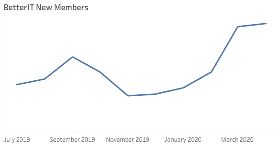
BetterIT is the premier Slack community for any IT professional looking to connect with her peers. We pride ourselves on the vibrant and diverse community we have built for BetterIT, and were thrilled to see new members flock to the community post-COVID-19.
Specifically, we saw a 100% increase in new members in March and April 2020 compared to February 2020.
As everyone moved to remote work, it made sense that IT admins would lean on the best practices and advice of their peers to navigate these new and challenging times. We look forward to seeing new members continue to join and add unique perspectives.
Our world has changed so drastically in such a short amount of time, but it is comforting to look at the data and validate that trends you expected to change actually did! We will continue to monitor these trends to see if the changes hold in the next six months.
Do you agree with these findings? Have you noticed similar trends? We’d love to hear your thoughts. Join the BetterIT Slack community to share your experiences with your peers!
With companies like Twitter, Shopify, and Facebook announcing long-term or even permanent WFH plans, the workplace will likely never be the same again. For guidance on how to navigate a remote-first world, download our new eBook, The Dream of Remote Work Is Here to Stay: 10 Common IT Pitfalls to Avoid in a World of SaaS.


